Stefan Deuchler
Human Computer Interaction
Running Buddy
Project&Role
Semester-long individual Project
UX Designer
For a semester-long individual project I designed a mobile app that connects local residents who are looking for a person to join them on a run. The app allows to search for people who are willing to go running at a certain date and time, for a certain amount of time, at a similar pace and who are willing to meet at a location that is no more than 5 minutes on foot away from their residence. The app will show potential matches solely based on their proximity and intended date and time to go running.
Concept Sketches
Discovery
In the initial stage of problem I sketched various alternatives to think broadly. Ideas included not only digital solutions, but also analog approaches, such as meeting potential running mates at a running store. Thinking widely and broadly allowed me to consider as many approaches as possible. During this phase, I also conducted a competitive analysis to see if a solution to my problem already existed and in what way other companies have addressed it.
Synthesis & Needfinding
During this phase, I synthesized the findings from my user interviews and from meetings with classmates. Talking to users helped me understand which of the approaches were feasible, and which ones might not be the right way to go. When sketching various workflows, I again considered various approaches. This step of the process again helped me to get clearer on my final design, while making sure I was staying open to new ideas and still ready to completely discard my solution. It felt that by considering alternatives and deciding they wouldn’t work, I was rewriting the storyline for the final solution, adding more depth to the narrative and making it flow smoother. I realized that I needed to remember what goals my users had and why they would be motivated to use my app. Eventually it became clear that it is a mixture, or an alternation of divergent and convergent thinking that is needed and I realized that without being consciously aware of it, I was really getting closer to my final solution.
Workflow Sketches
Sketching Interactions
Construction
After having listened to users, after analyzing feedback from users and classmates and after doing a lot of thinking, it was time to focus on the solution. Even though at this point I was pretty clear about the features the app had to provide, I needed to start thinking about how the app would accomplish those tasks. Sketching various approaches by hand was a good way to quickly come up with alternatives. I started to realize that sketching is not only a way of documenting a thought process, it is also a catalyst for new ideas. So I loosened up just a bit and tried sketching a little quicker, without preoccupying myself too much with artistic details, which I would never get right anyways.
Low-Fi Prototype
Low-fidelity Prototyping
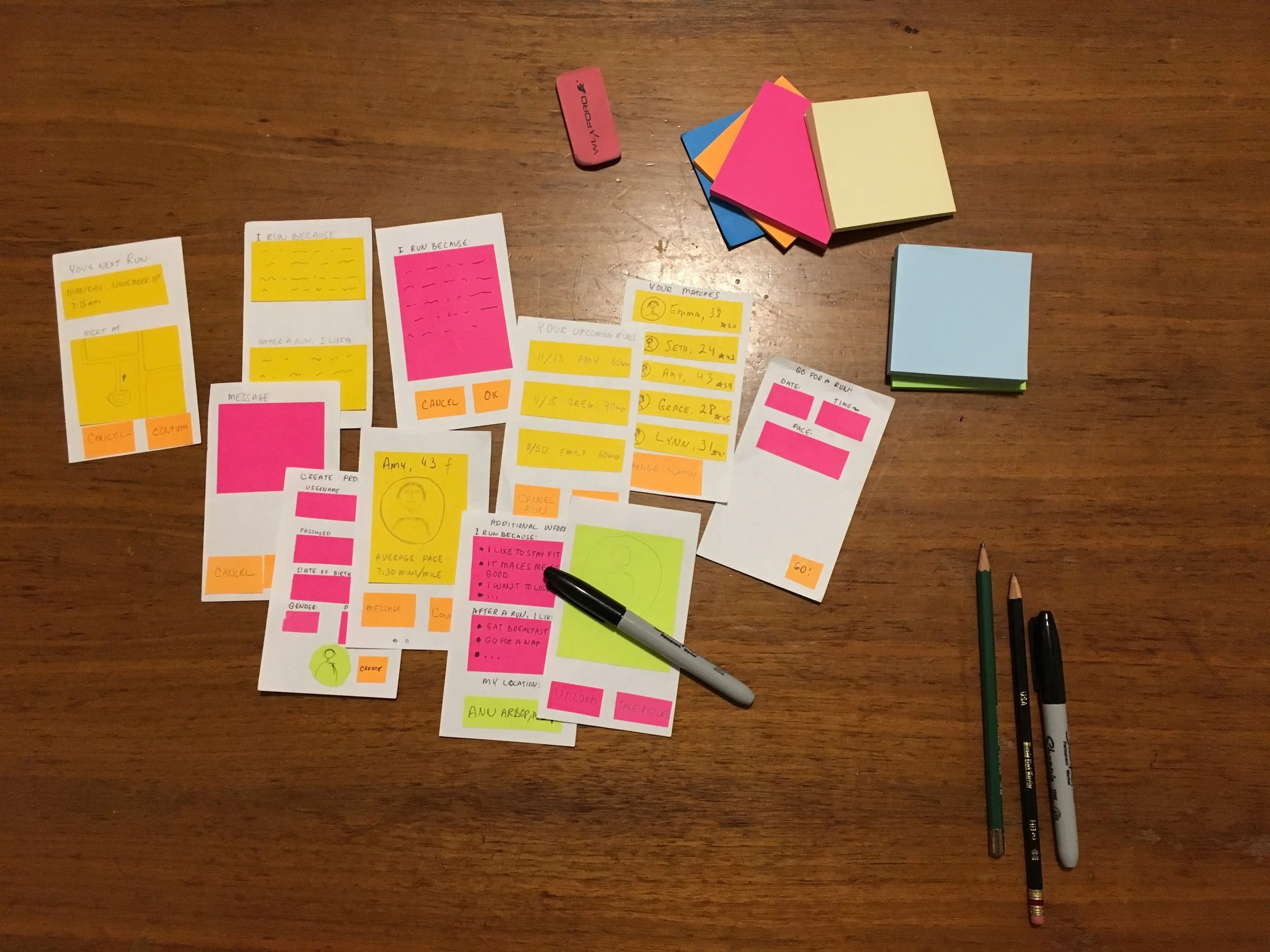
After considering various user scenarios, it was time to think about interactions with the app. Building a low-fidelity prototype on paper was a great way of quickly creating screens without having to deal with a prototyping tool just yet. Working with paper, scissors and sticky notes was a fun way of focusing on the function of various user interface elements. While showing my low-fidelity prototype to classmates, I gained a lot of valuable feedback, for instance that it wasn’t clear how to enter pace (in what format and whether users would not be confused by having to know one’s pace). I also learned that it was a good idea to have all of the profile information on a single page and to add two buttons to request to see additional information.
High-fidelity Prototype
While working on my hi-fidelity prototype, I took a step back and tried to decide if my app was still in line with my initial design philosophy that I decided on. My core belief was that the signup process must be as easy as possible and that the match-up of runners must be based on as little criteria as possible to allow for serendipity. I felt that the graphical design of the app must be friendly, yet very simple and calm. Since my goal is to bring people together to form friendships, and hopefully groups, the app should focus on the matching-up with new runners, and on the friends list. Those two parts need to work well and they need to remain the central focus of the app. Once two people went on a run together, they are free to exchange contact information and to meet again without using the app. They are also free to message each other using the app and to form larger groups to go running, or to hopefully engage in other activities as well. My design philosophy is to keep the app as simple as possible and to focus on the two core functionalities listed above.


